Recommended by UK Governments Business Link and also by Technology means Business 3Ge-Solutions
 
spacer

Creating a Site

The design should start with the corporate image, and is effected by the site contents, subsequently we can make some decisions about the site layout immediately

Example decisions to make:

  1. Corporate Colours?

    Are there are any additional colours to those displayed in your logo
  2. Structure of the site (determined by the company it represents)

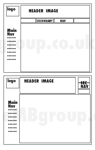
    If there are more than one core audience, a large 'secondary navigation' can lead users to their specific content. Alternatively the same could be used for companies with 2 or 3 specific types of product or service

    Secondary navigation can also be smaller and focused on "corporate information", leaving the main navigation for the products and services

    e.g.
    Second Navigation
  3. The plan of the website sections and pages (site map)
  4. What text and images to use for pages (Good keywords and content for aims)

A large amount of other free website design and creation advice can be found here: www.siteadvice.co.uk

Why be careful on layout?

Usability is about helping visitors find the information that will interest them.

Revenue is most often made by offering good, relevant, content that meets your business goals.

Search Engine Services